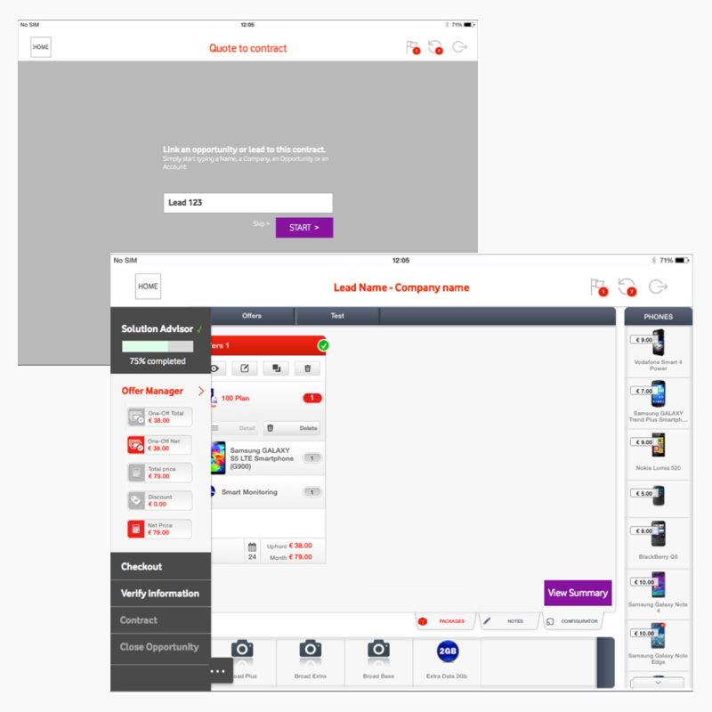
Improving B2B Phone sales
Redesigning and improving the tablet sales platform for a B2B audience.


1. UX review
Aim: get an overview of potential quick fixes for the app
Two weeks of research resulting in 100 pages document and a long list of easily fixable issues that would demand a complete remodelling of the app which the client couldn’t undertake.
Decision was taken to work on some key features that would drastically improve the experience.
The project demanded small incremental changes that wouldn’t take the big picture into account.
This was done through weekly sprints that included a brief, a proposition, a clickable prototype and the corresponding documentation.

2. Mapping out the problem
During the last month of the project, the client required more «visible» changes be provided to improve the overall use of the platform significantly.
This last sprint lasted 4 weeks and allowed me to come up with more interesting solutions that would help the user base much better:
- Allow users to know what they are doing at all times and what their next steps should be.
- Help users in their every day life for follow-ups and client management
- Help users close deals on the spot with e-signature / digital contracts

3. Mapping out ideas
This sitemap is a redesign which combines the two main views the agent will need to sell their products: one customer facing and the other private, where the agent can follow up on clients, add tasks, apply discounts, etc.

4. researching solutions
Brainstorming on the whiteboard was my main activity during the research period - I would ask the opinion of other UX designers from the team and from outside the team to improve and get rid / keep solutions and iterate.

5. Implementing solutions
I created a recommendations document illustrating a new solution. However, because of the lack of time to work to the full extent of this, the solution I proposed had some holes and some issues.
It still helped improve the overall experience!