Open Data Publishing
Helping speed up and automate the process of publishing high-quality open data. Find the user report here and visit Octopub.io.
Please note: the development is not finalised due to lack of time and resources.


1. Understanding the users
A huge part of the project was to understand the data publishers’ needs when it came to opening their data, the main question being: “Why don’t they do it?!”
We interviews more than 30 people and did 4 workshops over the UK to try to understand this and get an answer to the question.

2. User needs mapping
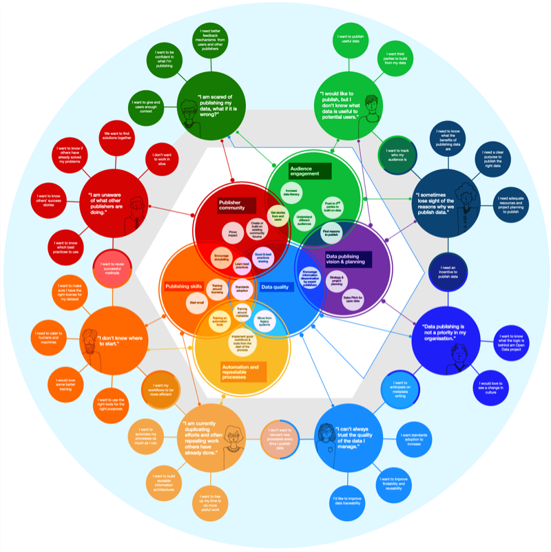
The end result of the Discovery part of the project was a 20 pages long report on user needs and this diagram.
The user needs diagram has been used in subsequent workshops to help data publishers and their teams to start constructive dialogues.

3. Ideal user journey
The new solution would help users learn how to publish more effectively and allow them to do it on their own confidently.
This map represents the user journey a publisher could go through to open their data, increasing simplicity and uptake.
It is based on the current journey map for the ODI’s data publishing tool (Octopub), combined with the user needs.

4. First sketches
The new Octopub website would help users understand the process they’re going through, what they should do next and why.
It would be quite hand-holdy for new users and allow more experienced ones to go through the steps quickly, without hindrance.
A big emphasis was put on the inline help and simple wording.

5. Usability testing
With a questionnaire and a fully clickable Axure prototype, I recontacted a lot of the people I’d talked to in the first phase of the project.
I wanted to know if they would understand how to use Octopub, and if it would answer their needs.
I also felt it important to keep them informed in the project to have a better chance of uptake once the new version was live.

6. Iterations
The usability test surfaced some context issues, where the user wouldn’t know how to start or what it meant to publish data online. There was a need for vocabulary explanations and a more robust help section.
This was done through a more detailed pre-sign in homepage and a wizard explaining licensing as well as inline vocabulary help.
< New homepage (using the newly designed UI)

7. Documentation
The development team needed to work on delivering the project, but I was leaving for my maternity leave. I had to document everything in details to ensure they would be able to program easily, without too many problems.
We had a month of overlap before I had to leave, which helped a lot. We decided to use Zeplin as we had no real front-end developer and that would streamline the process significantly.

8. Documentation ctd
Because some of the flows had become quite complex, it was important to higlight how things were supposed to hang together.
This was an explanation for the “help me choose a licence” Wizard.
It was tested by users and worked very well for all types of audiences.